Welcome
Generator Design is a complete advertising and design agency specializing in print, web, social media and email solutions for businesses.
Our Services
What can we do for you?


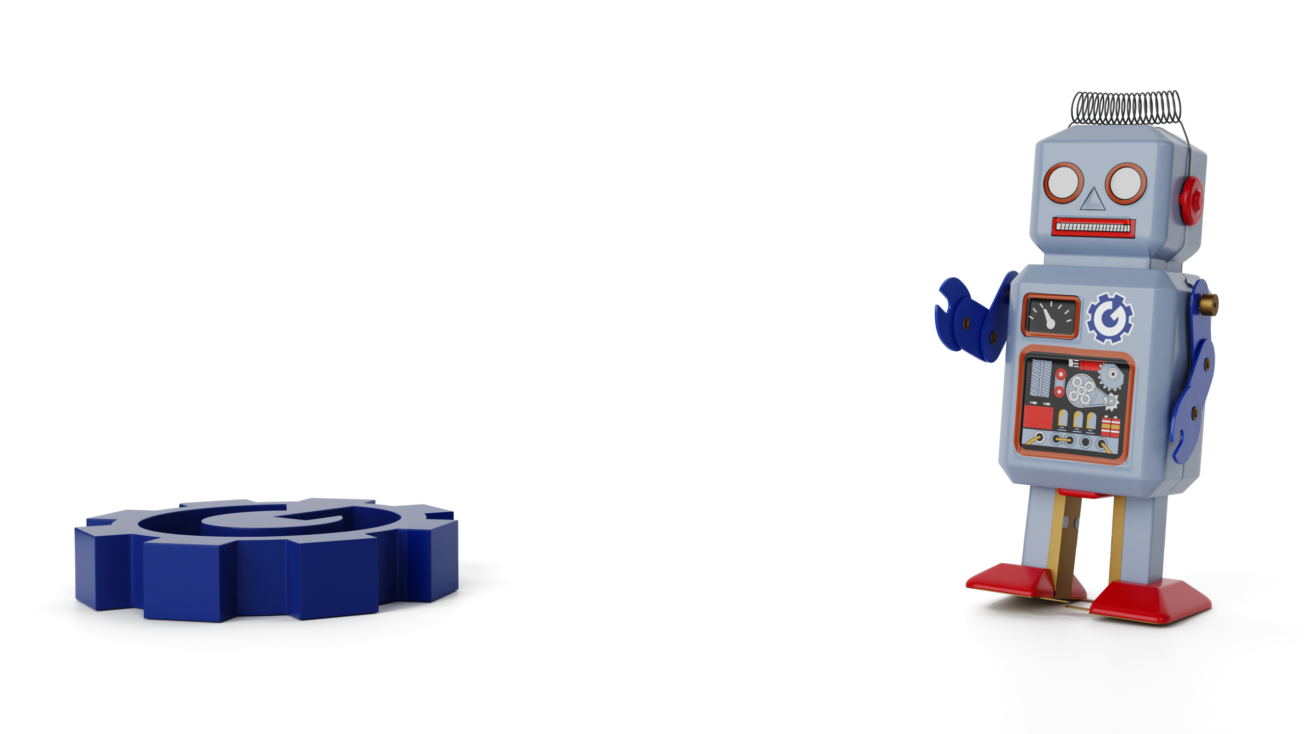
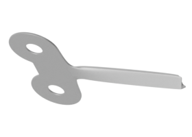
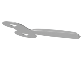
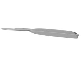
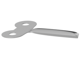
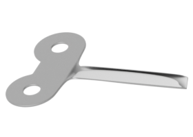
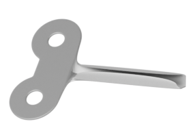
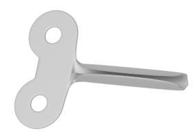
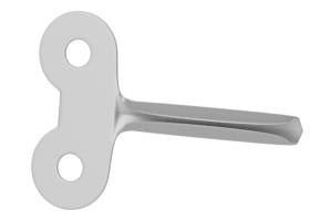
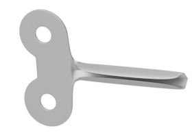
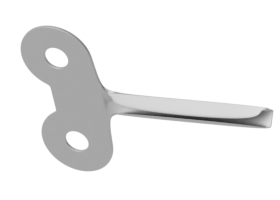
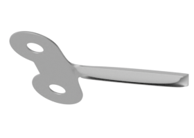
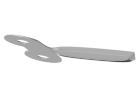
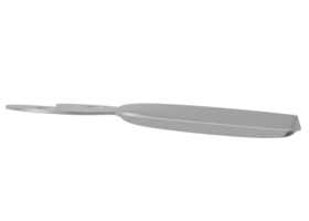
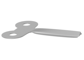
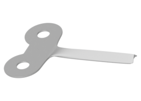
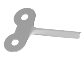
WindUp
is Back!
Nominations
Open May 6
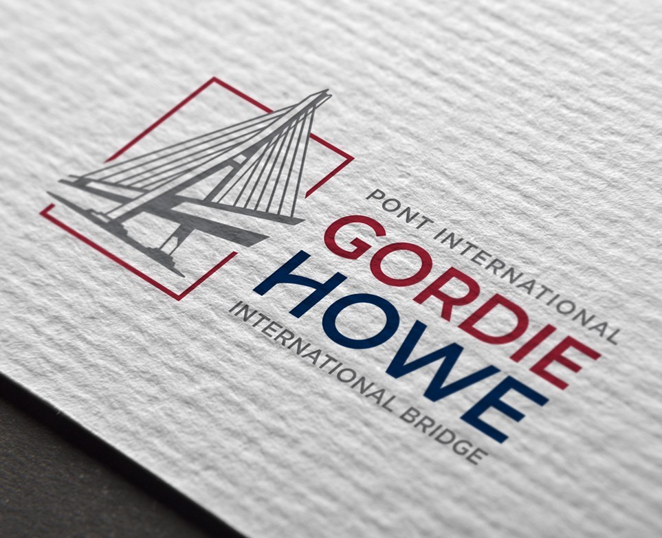
Feature
A bridge, a symbol. It’s not every day that an international border crossing gets built. Presented with the once-in-a-lifetime opportunity to work with the Windsor-Detroit Bridge Authority and the Gordie Howe International Bridge, Generator Design jumped with creative buzz. This is “howe” we set out to brand North America’s newest border crossing.
Need a Quote?
Whether you are just starting a new business or are an established organization in need of a refresh, we can help you. Simply click the link below and start the conversation today.
Visit Our Blog
Visit Our Blog
-
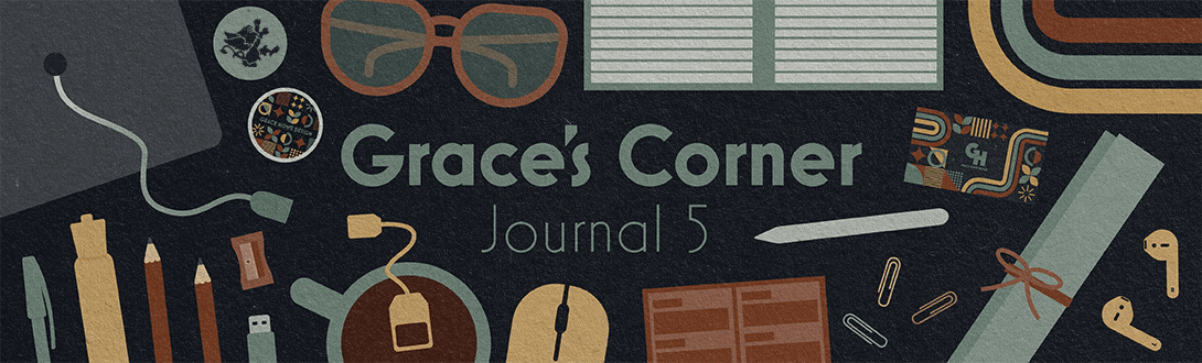
Grace’s Corner – Journal Entry 5
Read more: Grace’s Corner – Journal Entry 5My final week of internship is over and to say it’s bittersweet is an understatement. I’m sad to say goodbye to the team, but am looking forward to starting my career as a graphic designer and where I can go from here. I’ve really enjoyed my time at Generator and have been able to work…
-
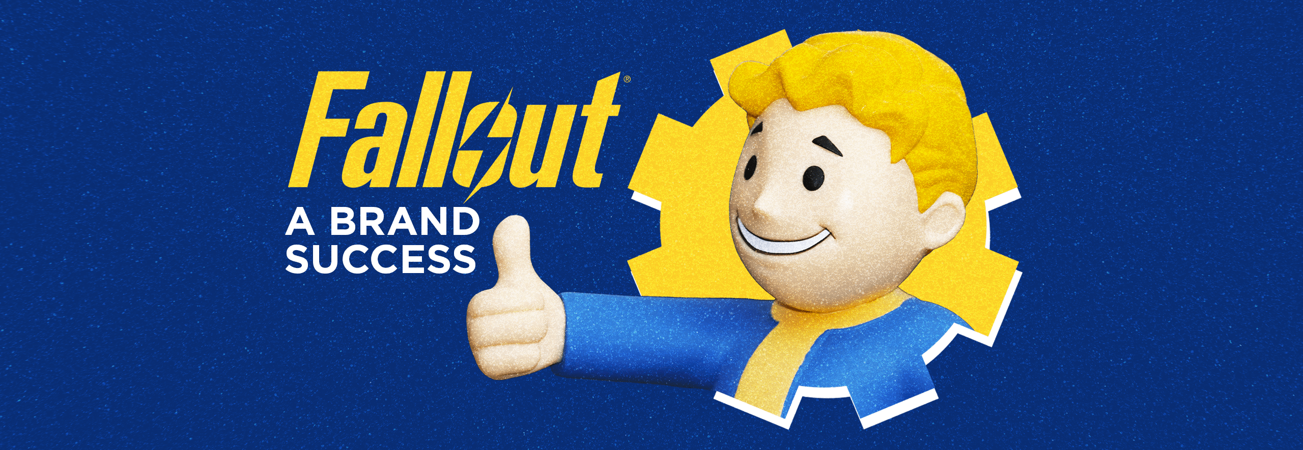
Fallout: A Brand Success
Read more: Fallout: A Brand SuccessGenerator Design is comprised of individuals possessing a unified passion for design. While each of us have our own unique hobbies and passions, one of mine is video games. Specifically, the Fallout series. If you’re a longtime fan like me, then allow me to further specify my love of Fallout 3 and Fallout 4, and of…
-
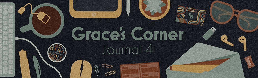
Grace’s Corner Journal Entry 4
Read more: Grace’s Corner Journal Entry 4Week five is officially over and I’m happy to write all about another great week of my internship. I feel that I’ve learned a lot this week, especially when it comes to more of the ideation and creative processes in an industry setting. I’ve been working on some more social media projects as well as…
Sign Up for Our Mailing List
The team at Generator Design is composed of talent, creativity and innovation. They take the time to connect with their clients and cultivate relationships.
— Kelly Blais, Media Street Productions
Follow Us
Let’s Stay Connected
Stay connected with Generator on social media.